


While developing features for our data dashboard, I stumbled upon an unexpected discovery: a customer was experiencing issues with their heating system without being aware of it. It was easy to spot the issue just by looking, but the real challenge was creating an algorithm to do the same. The complexity of crafting such an algorithm was a bit daunting. As a temporary measure, we opted for a human-centric approach, assigning a working student to manually review the data by looking at the data dashboard each week.
Recently, at OpenAI Dev Day, I had a lightbulb moment. The question popped up: Can ChatGPT, famous for working with text, also make sense of charts? Honestly, I had my doubts. It seemed like a stretch, yet interesting enough to try out. To my surprise, ChatGPT was actually not that bad at interpreting chart data.
While I'm still a bit unsure about how useful this is right now, the success of these tests is worth mentioning. It seems like not many in the AI field have talked about this, so I wanted to share my experience. Let's dive into these experiments together and see how ChatGPT can handle graphs and charts in ways that might surprise you.
1) The initial idea: "Tell me what might be wrong here"
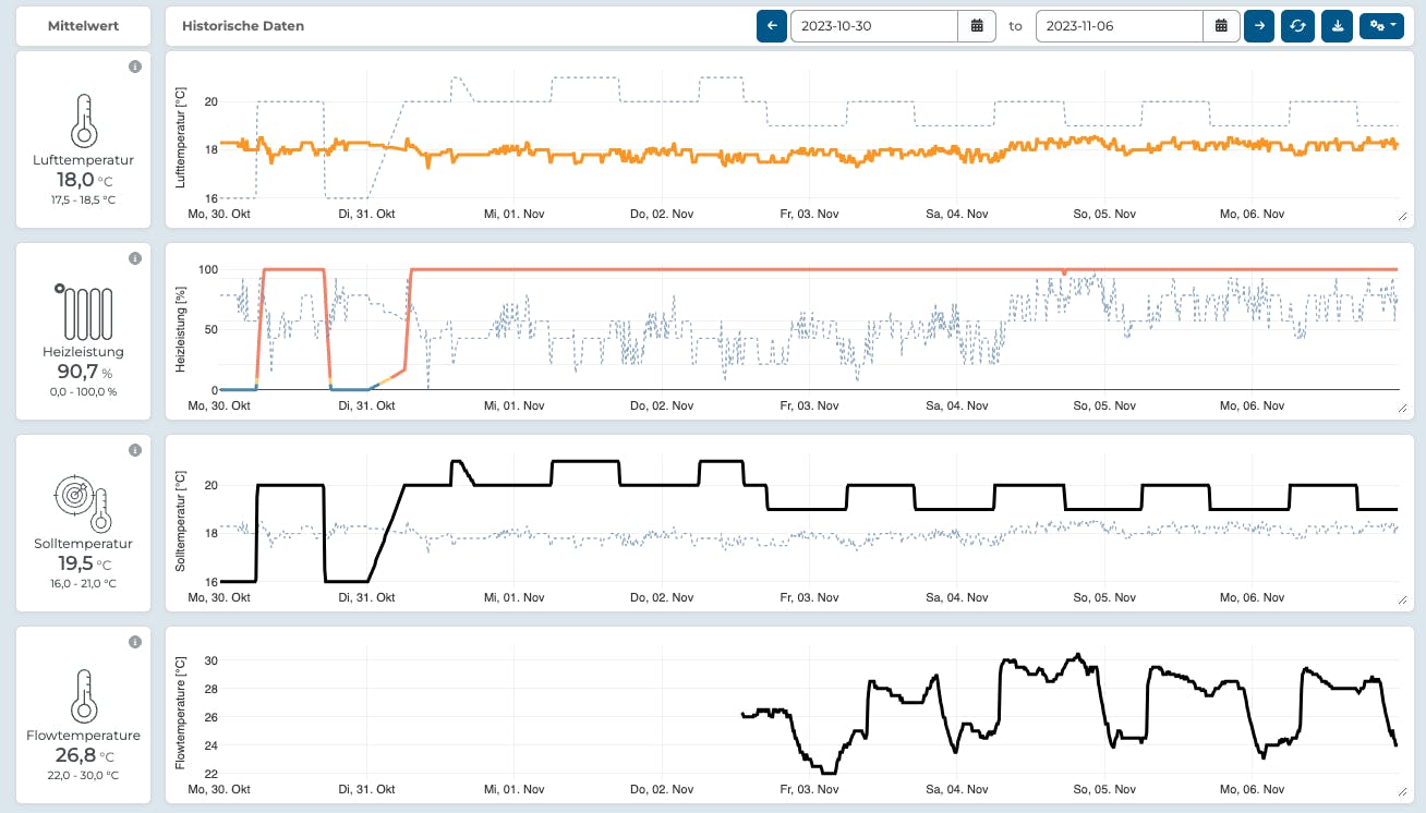
This example shows a basic error we're trying to catch. The room's temperature stays almost the same and doesn't match the target temperature, shown as a dotted line in the first chart. The second chart displays the heating power we're sending through the valve. It's at 100% most of the time, but it doesn't seem to raise the room's temperature at all.
Step 1: Add just very few context
"For my first attempt, I simply described what was in the image, to test if ChatGPT could understand anything from it.
Prompt: "This is a plot from a dashboard for a smart thermostat. The first graph is the Temperature with the setpoint in the background as a dottet line, the second graph "Heizleistung" is the "heating power" which is the position of the valve. The third graph is the Setpoint temperature with the actual temperature as a dashed line. The fourth plot it the "flowtemperature", which is the temperature of the water in the heating element. Can you spot a malfunction of the control system?"
ChatGPT: Air Temperature (Lufttemperatur): The room's air temperature remains mostly stable, slightly fluctuating around the setpoint. This graph suggests a well-regulated temperature within the room, staying close to the desired setpoint with minimal variance.
Heating Power (Heizleistung): There is a significant period where the heating power is at or near 100%, which may suggest an attempt to correct a large temperature discrepancy or respond to a significant drop in temperature. However, despite this high heating power, the actual temperature doesn't appear to overshoot the setpoint by a large margin, which is positive. It's worth noting that the dense clustering of dots, especially during the times when the heating power is"

At first glance, this looks like chatGPT completely misses what's actually going on and was about to close this experiment as a "nice try". But one sentence caught my attention: "However, despite this high heating power, the actual temperature doesn't appear to overshoot the setpoint by a large margin." This was a correct observation, just not interpreted correctly. It showed that ChatGPT may have some understanding of the shown data!
Step 2: "Let me tell you what to look for and tell me what's wrong".
Maybe we just need a little prompt tuning? I added a very long explanation of what to look for. Here is the full prompt as a reference:
Prompt: You are a thermostat control system data analyst. I will show you the historic sensor data of a dashboard of a smart thermostat and you try to evaluate if it has potential problems that we need to tell the user. This is a plot from a dashboard for a smart thermostat. 1) The first graph is the (air) temperature in orange, red or green with the setpoint in the background as a dashed gray line 2) the second graph "valve position" also called "heating power" which is the position of the water valve to the heating element with a blue, yellow or red line. 0% means no heating, 100% means all heating available. In the background of this plot is the actual temperature as a gray dashed line. 3) The third graph is the Setpoint temperature that the user selected with a black line and the actual temperature again as a gray dashed line. 4) The fourth plot is the "flowtemperature", which is the temperature of the water in the heating element with a black line. The actual temperature in 1) should somehow follow the setpoint temperature and now over- or undershoot more than 1°C during the day. On night times it is expected, that the temperature will not directly follow the drop in the setpoint since the room needs to cool down. Thats okay. The heating power in 2) indicates, that we are currently trying to heat the room. I might be, that the heating system is not responding e.g. in case the water valve to the heating element is closed or malfunctioning. You should see a rise in the temperature in 2) or 1) once the heating power rises. In case the target temperature is not met over a longer period of time while heating power is 100%, there is clearly not enough heat to heat up the room. The flow temperature might be an indicator if the heating boiler system works at all. In case the heating power is set to 100% and we dont see a rise in flow temperature, there is probably a problem with the system. The target overall is to save energy while maintinaing a good temperature during working hours. You carefully remember all of this and review dashboard images accordingly.
And chatGPT's answer:
Based on the image provided of the dashboard for a smart thermostat, here's an analysis of each of the graphs:
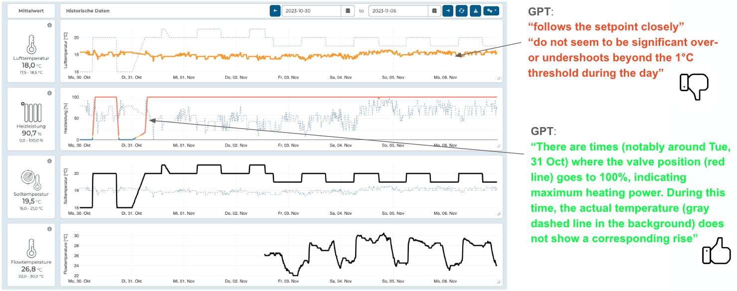
Air Temperature: The air temperature (orange line) appears to be relatively stable and follows the setpoint (dashed gray line) closely. There are minimal fluctuations, which is a good sign that the thermostat is maintaining the desired temperature within the expected tolerance. There do not seem to be significant over- or undershoots beyond the 1°C threshold during the day. This suggests the system is responding appropriately to the setpoint.Valve Position/Heating Power: There are times (notably around Tue, 31 Oct) where the valve position (red line) goes to 100%, indicating maximum heating power. During this time, the actual temperature (gray dashed line in the background) does not show a corresponding rise, which could indicate that the room isn't heating up as one would expect when the valve is fully open. This may be a sign that either the heating system is unable to provide enough heat or there's an issue with the valve not actually allowing flow despite indicating it's fully open.
Setpoint Temperature: The setpoint temperature (black line) is adjusted at several points, and it's clear that the actual temperature (gray dashed line) tends to follow these adjustments, though not always immediately. This lag could be normal due to thermal inertia, as you've noted that it's expected for the temperature not to follow the drop during night times immediately.
Flow Temperature: The flow temperature (black line) does show variations, and these should correspond to the valve positions. However, the graph seems to indicate that the flow temperature does drop at times even when the valve position is high (close to 100%). If this happens without a corresponding decrease in valve position, it might indicate a problem with the boiler system not heating the water adequately.
Based on these observations, the main concerns would be:
The periods where the valve position is at 100% but there isn't a corresponding increase in either the air temperature or the flow temperature. The potential lack of responsiveness of the system when the setpoint temperature is changed, which could indicate an issue with system latency or an underperforming heating system. It would be recommended to check the heating system, especially the water valve and the boiler, to ensure they are functioning properly. If the valve is not truly opening or if the boiler is not heating the water adequately, these would need to be addressed to ensure the system can maintain the desired temperature efficiently.
ChatGPT got a lot of observations wrong, but some were correct! The final summary actually described the main problem well. It seems like ChatGPT may interpret charts given a description of what to look at. But there are also so many incorrect observations...
Step 3: "Go step by step, review your observations and finally pick one"
It looks like even after adjusting the prompt, ChatGPT still makes some incorrect observations when given a zero-shot prompt. ChatGPT seems to struggle with understanding concepts like "close enough" or measuring the difference between two lines. In our case, the temperature was stable but not following the setpoint, which ChatGPT failed to consistently detect, even with prompt engineering.
However, the fact that there were also some correct observations is promising. It suggests that with a follow-up prompt, we might be able to guide ChatGPT to focus on and expand upon its accurate observations.
I tuned the initial prompt to make the initial response more detailed and then using a second prompt to ask ChatGPT to focus on the observation it is most confident about is a good strategy. This two-step process could help filter out incorrect interpretations and highlight the AI's more accurate insights.
Prompt after first response: We want to contact the user. Pick the most critical observation and summarize it in at most two sentences. This will be send to the user so it should be correct and professional. Respond in this format: 03.11.2023 10:00 - 03.11.23 23:00 : OBSERVATION
ChatGPT:
03.11.2023 10:00 - 03.11.2023 23:00: Our monitoring indicates that the heating system is frequently operating at full capacity without adequately increasing the room temperature. This may suggest a potential issue with the system's ability to deliver heat efficiently, and we recommend a system check to ensure optimal performance and comfort.

This looks promising, but there's a chance it might not truly understand and just hallucinated answers I might like. It could be making good guesses based on the errors I mentioned in my prompt. The selected time seems to be random, why didnt it pick up the whole time frame from 31st Oct until the end? I will explore the time frame detection in a later post. When providing examples of correct working thermostats it didn't make the same observations. But this isn't solid proof of its understanding and I think I might need to go one step back and test chatGPT's basic skills in understanding.
2) Basic chart data reading
Let's test if ChatGPT can interpret data. I began with a basic time series chart depicting a fluctuating sine wave, which includes an anomaly. This graph represents the temperature in a forest experiencing a nighttime fire. I used this image to explore what ChatGPT can discern from it. Interestingly chatGPT initially refuses to do this! Some motivational pep talk was needed for it to try.
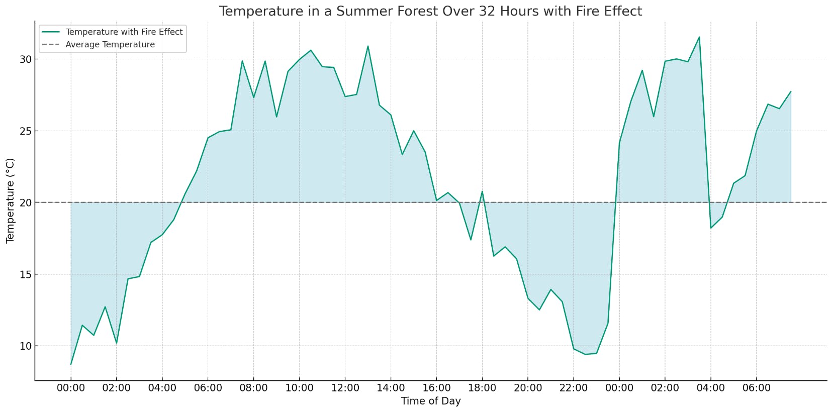
Prompt: This is a screenshot of a sensor dashboard. Carefully look at the graph and the time shown on the axis. You try really hard to be correct and exact. Im under pressure so you have to help me. I know this is hard, but please try. Return a list of time and value that represents this plot. It doesnt need to be perfect. Just as good as possible. Return a value for every hour in a JSON structrue. Do not explain.
I created a plot that compares the values ChatGPT returned with the original data.

Not that bad! ChatGPT did well in some areas, capturing the early part of the graph pretty accurately. It traced the overall trend well, but it totally missed the anomaly later in the chart. Despite trying various prompts, asking for a review, and self-reflection, ChatGPT was unable to identify the anomaly. Overall, it's fair to conclude that ChatGPT can extract values from a chart, though with limited accuracy and it seems to follow general trends. Improving the chart's design might enhance this accuracy. I plan to delve into this in a future article. (Spoiler alert: initial tests suggest that tweaking the chart doesn't significantly improve accuracy.)
In the first part of my experiments, I found that ChatGPT can read and understand data from a chart, but its accuracy is limited. Next, I plan to explore how ChatGPT processes chart information. Although this method currently has limited practical use and there are likely better approaches, like LSTM or parsing data JSON encoded instead of visually. However, it's an interesting topic to investigate and who knows how ChatGPT will evolve in the future.
In the second part of this series, I'll conduct more experiments to provide a more quantitative analysis of ChatGPT's strengths and weaknesses reading chart data.
Observations so far
ChatGPT can read data from a chart with limited accuracy
ChatGPT can correlate two distinct plots and compare their relative trend.
ChatGPT struggles to merge visual proximity with numerical similarity. It often fails to grasp the differences between two lines on a chart. Additionally, when we zoom in on the same data, ChatGPT's interpretations change. (More in part 2)
ChatGPT can identify the timing of events observed in data, but its consistency is not always reliable. (More in part 2)
Update on Part 2: GPT became more restrictive and simply refuses to readout the data from the chart more and more. Need to investigate a reliable jailbreak before part 2.